ANA
An app that simplifies search for advanced yogis.
̌
Project Overview
These days, yoga is everywhere. You can barely cross a street in most cities without seeing someone in fitness leggings or carrying a mat on their backs. While the practice of yoga is now a widely accepted part of life, the search for advanced yogis to find new classes or teachers is another story. New or casual practitioners are generally satisfied with existing tools to search for the nearest classes. Advanced yogis on the other hand, do not have an efficient way to find an experience that will fit their particular needs and goals.

Project Scope:
Project Type: Mobile Application
Platform: iOS
Deliverables: C&C Analysis, User Research Artifacts, User Flows, Sketches, High Fidelity Wireframes, Clickable Prototype, Logo, Style Guide
Tools: Pen & Paper, Whiteboard, Illustrator, Photoshop, Sketch, InVision
My Role:
User Research
UX Design
UI Design
Visual Design
THE PROBLEM:
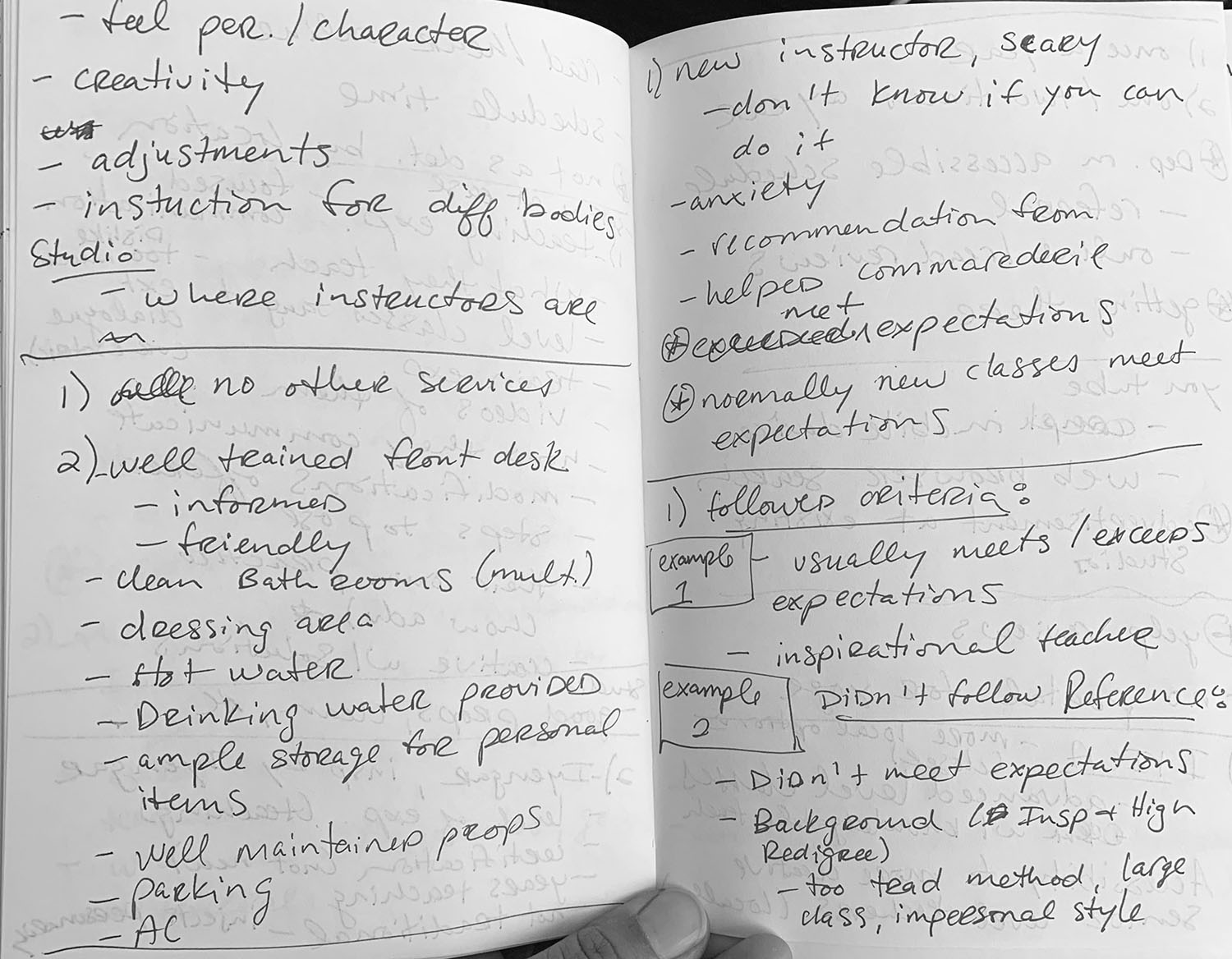
Dedicated Yogis need a better way to find classes and teachers that fit their unique yoga needs, preferences, and goals. When conducting research, advanced yogis were having trouble finding appropriate level classes, gathering in depth Teacher information and trusting class experiences prior to trying them out.
The Solution:
ANA is an app that matches advanced yogis with their ideal class experiences and teachers.
research:

Initial Thoughts & Assumptions:
Before diving into the research process, I wrote down some of my initial ideas and assumptions around the challenge that dedicated yogis face. As a practicing yogi, I wanted to know ahead of time any predetermined biases or personal thoughts I had towards this topic so that those ideas could be separated and tested.
My initial idea was, most advanced yogis seem to rely heavily on friend recommendations when searching for new teachers or classes. Was there something there that we could explore there? …Some tool that would allow users to connect with more yoga experiences through their trusted relationships…or perhaps a tool to motivate them to practice more?
Since yoga is a wide marketplace, I needed to define some constraints and hone in my study on a smaller audience. I became interested in the challenges of advanced yoga practitioners, assuming that these students require more information and filtering options than their casual or beginner counterparts.
Were advanced yogis satisfied with existing tools?
Where / How were they getting their information?
Is there an existing problem that design methods could serve and assist?

User Interviews:
Once I had a grasp on my thoughts, it was time to start some generative research to see whether any of my pre-existing hypotheses held up. I conducted multiple interviews that would allow me to get to know our users better, and to determine what our design problem should be.
Speaking with real life yogis allowed me to develop empathy and read between the lines to better understand or validate their needs and increase our chances at design success. Using a definitive research plan I was able to identify the following…
major takeaways:
The physical and mental benefits of yoga are equal in their motivations for practice.
Advanced yogis’ most common goal is just to practice more consistently.
Many yogis are having trouble finding the right teachers to meet their particular preferences and goals.
Yogis are often unsure of what to expect or what will be expected of them when trying something new.
Yoga is a communal practice. Even advanced practitioners still prefer practicing in groups to studying at home.
The advice of friends is often their most trusted source of information.
““I definitely check (a teacher’s) background and how long they’ve been teaching and where they studied, that was critical.””
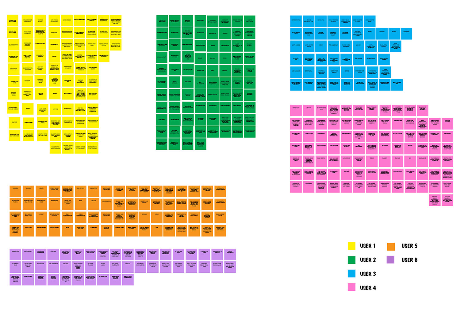
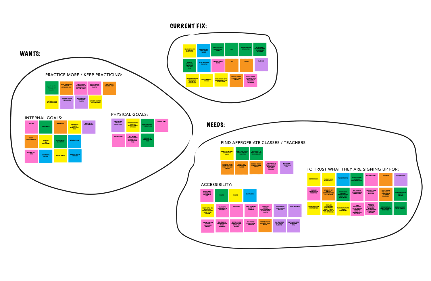
SYNTHESIZING RESEARCH:
To best identify all the information revealed through user interviews, it was necessary to not just rely on notes and recorded information, but to actually synthesize our findings. I used affinity mapping to analyze results quickly and effectively. In this method each interviewee is assigned a Post It color and similar statements are grouped in themes allowing us to easily visualize reoccurring wants and needs. The resulting board highlights majority goals, motivations, and pain points occurring for advanced yogis.
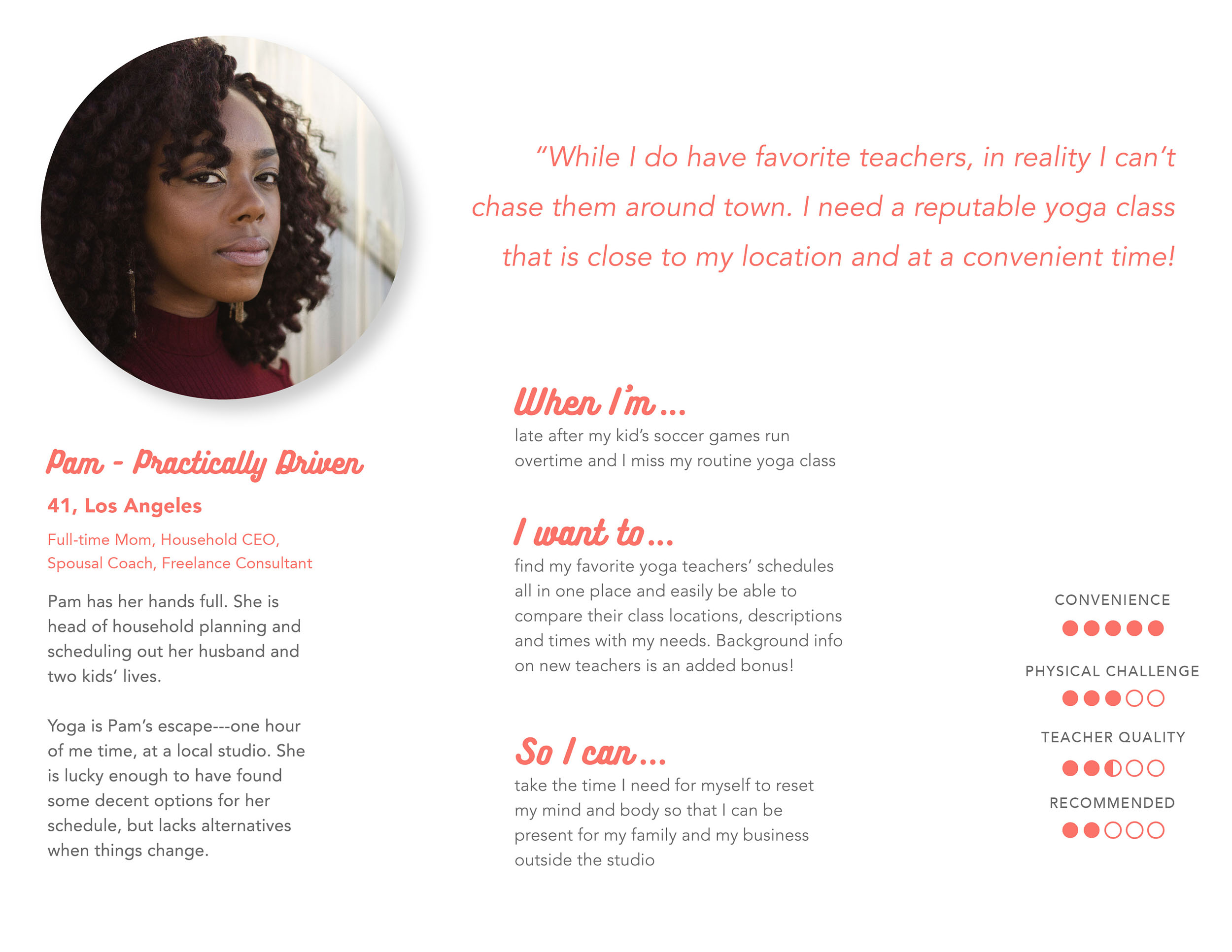
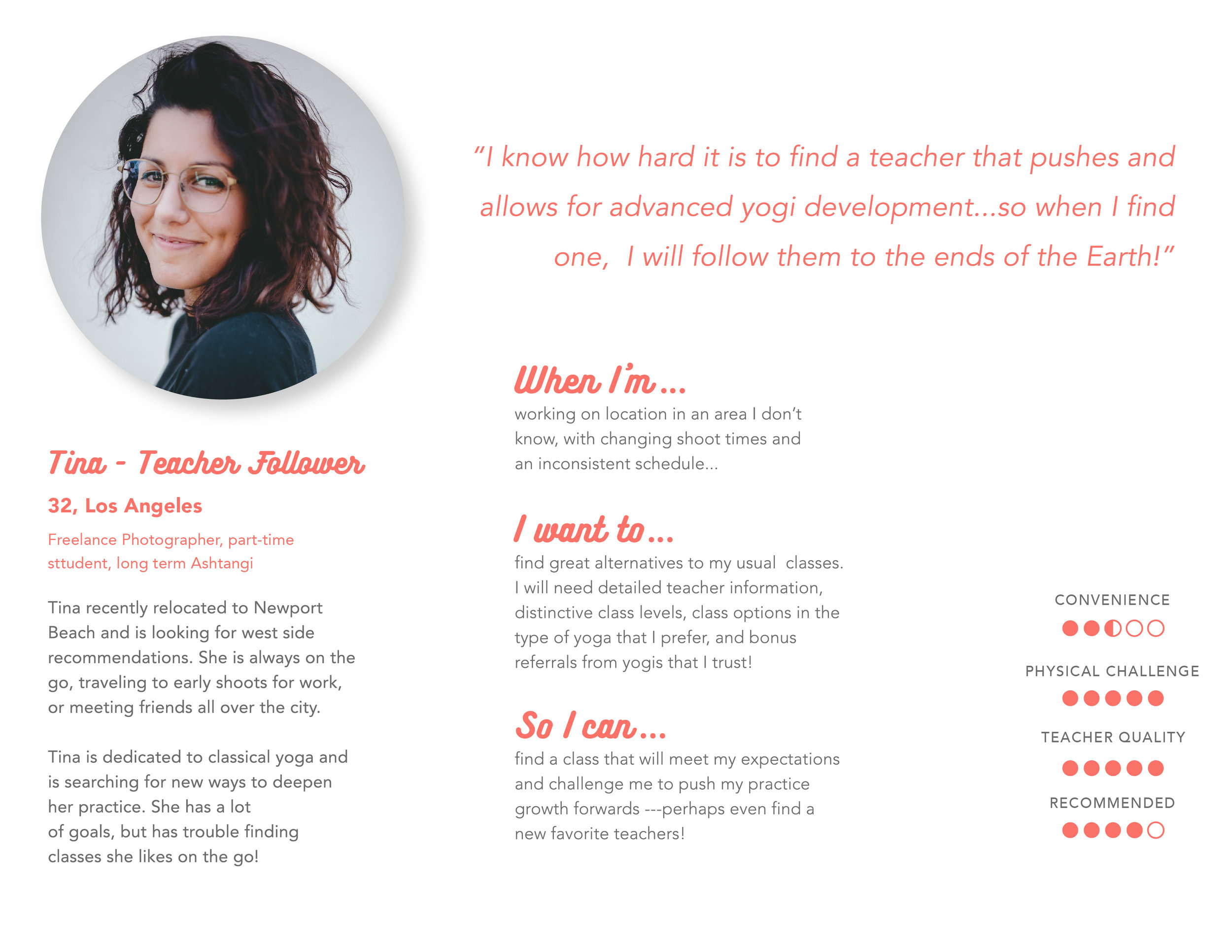
PERSONAS & USER FLOWS:
After meeting and speaking with users individually and learning what their needs/wants are, I decided to create an artifact that is actionable in the form of two user personas. These personas would represent key summaries found in user research data and help me design more effectively for our audience. Constructing an identity to our main research findings allows us to empathize to a greater degree and focus on what is most important. Rather than asking ourselves, what can this product do, we are able to explore:
What would Pam do with this product?
How would Tina go about using this feature?
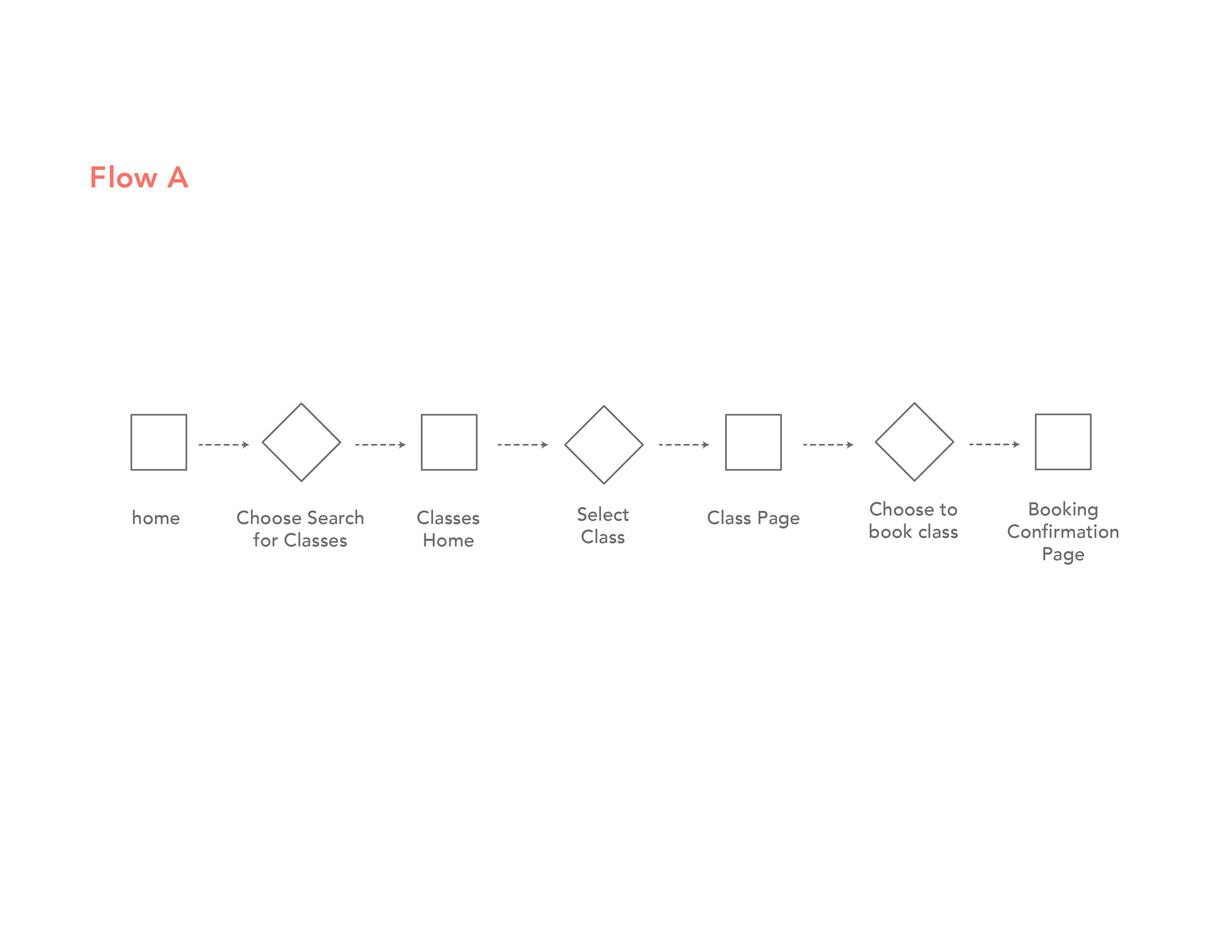
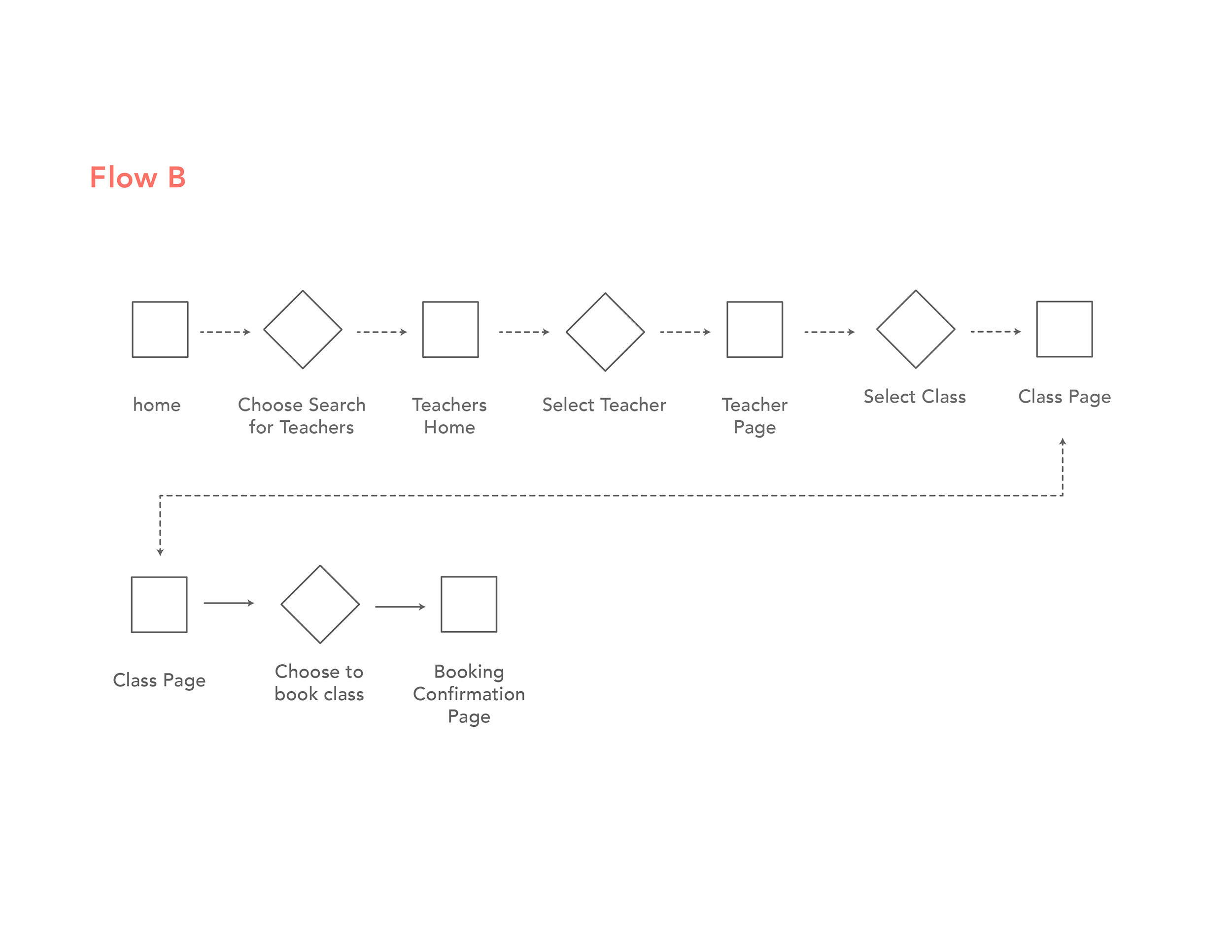
This line of inquiry kept us from projecting our own personal thoughts and feelings, allowing us to objectively see what is truly needed most. To further clarify, I mapped out these major needs in the form of two happy user flows one for each persona.
““I like to take advanced classes, if they are taught by the right people.”
”
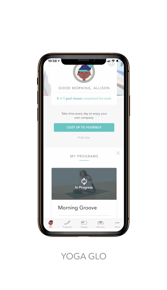
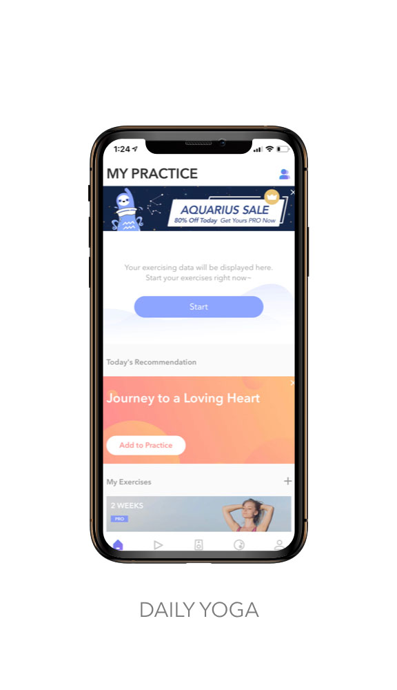
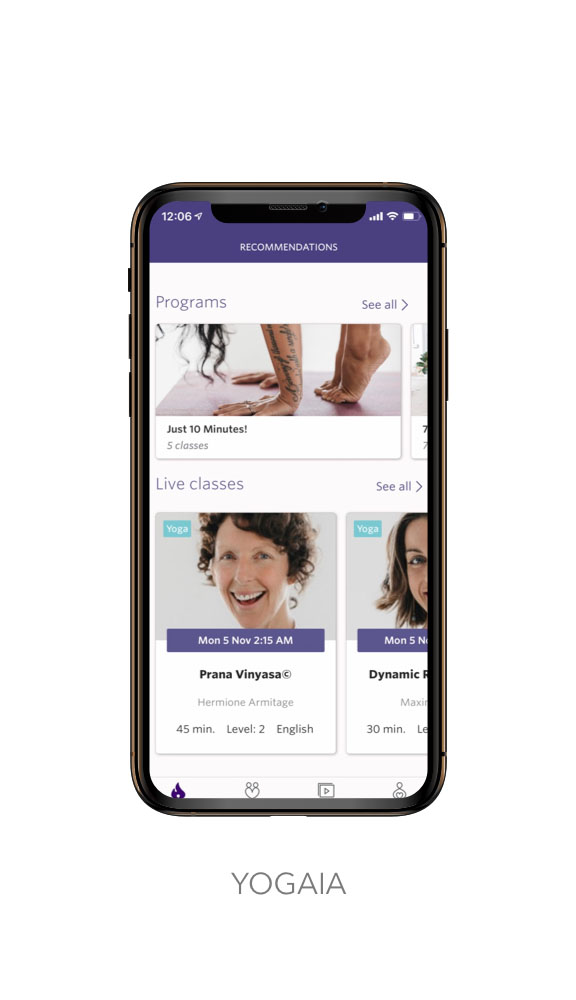
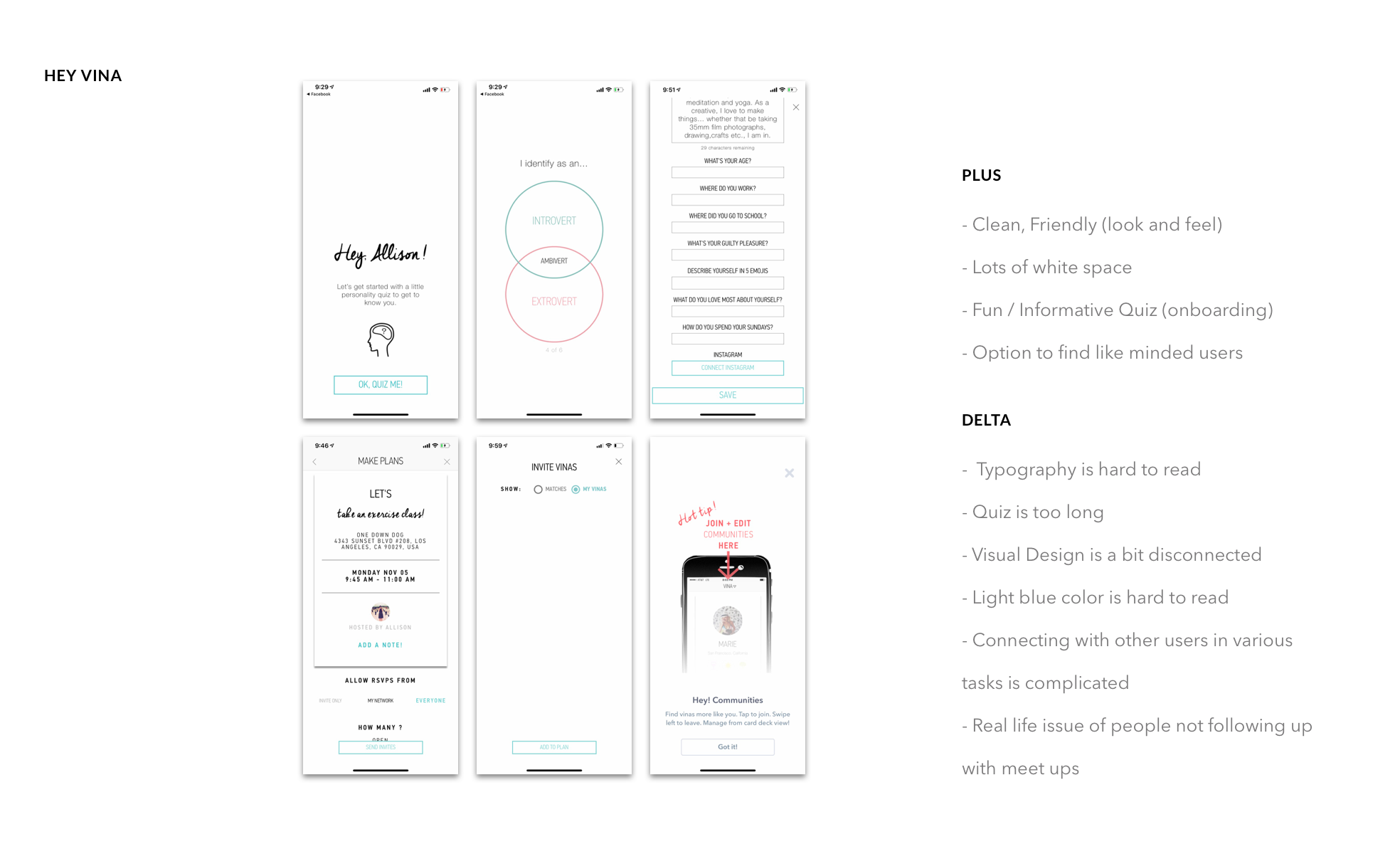
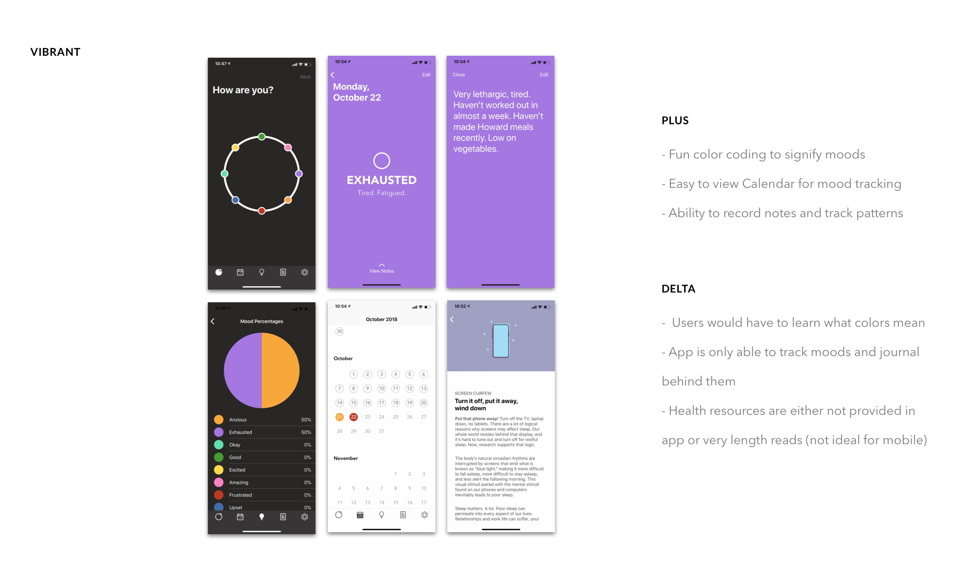
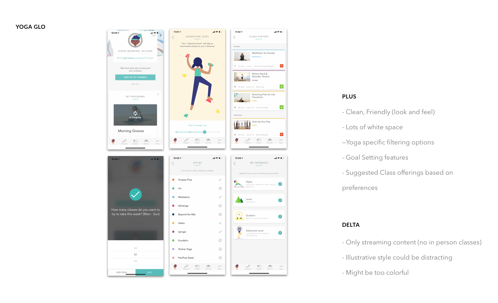
COMPARATIVE & COMPETITIVE ANALYSIS:
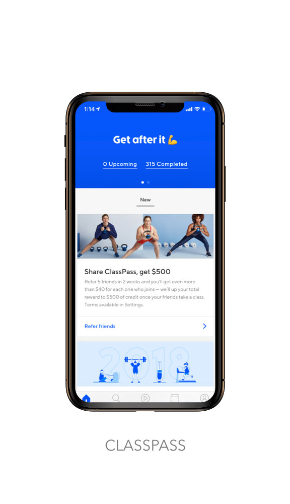
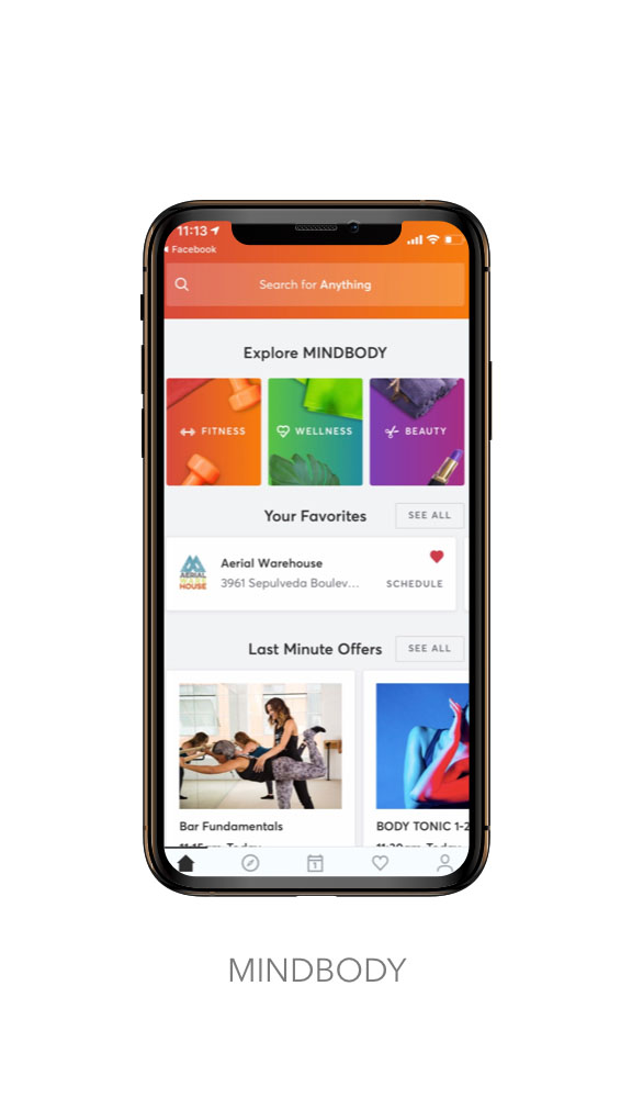
Now that I knew who I was designing for, it was time to conduct an exploratory analysis of the existing market to see what opportunities there were to distinguish ourselves and solve the problems I had identified in user research. I began by looking at our direct competitors, performing task analysis and assessing their relative strengths and weaknesses to see what has worked well for them and what hasn’t. I visualized this information by creating plus / delta charts with key screenshots that were then combined towards a more comprehensive feature inventory comparison. The same steps were applied for analogous competitors who we feel are setting user expectations in how a product like ours would be experienced.
MAJOR TAKEAWAYS:
No yoga specific filtering options.
Colors of competitors often too bright and saturated.
Cold and unwelcoming look and feel.
Not enough teacher information.
Users must leave the app to access important details.

Quick Storyboard of an Ideal User Flow for Revised Problem
REVISED PROBLEM STATEMENT:
Now that I had focused in on who we were designing for, what they needed, and what already exists, it was time to step back and scrutinize our initial hypotheses once again. Originally, I was focused on the user need to practice more consistently by considering a motivational tool, one that perhaps involved reminders on the rewards of practicing yoga, as well as accountability prompts from friends.
However, when I further evaluated our primary user need…the increased consistency of practice, I found myself asking why users were missing class and not meeting their practice goals. The more I considered, the more I realized that the desire to practice wasn’t an issue for advanced yogis. Yoga has been a constant part of their lives for many years now. Our users already know, quite well, the benefits of practicing yoga.
Therefore, I decided to pivot my focus to the possibility that the issues in practice consistency might lie more within inadequate tools being used to try and find what they were looking for.
Could I create a solution that would match them more effectively to appropriate yoga mentors and classes?
“how might we ...
... make the search for yoga feel as calm as practicing it?
”
“how might we ...
... make student / teacher matches more successful?”
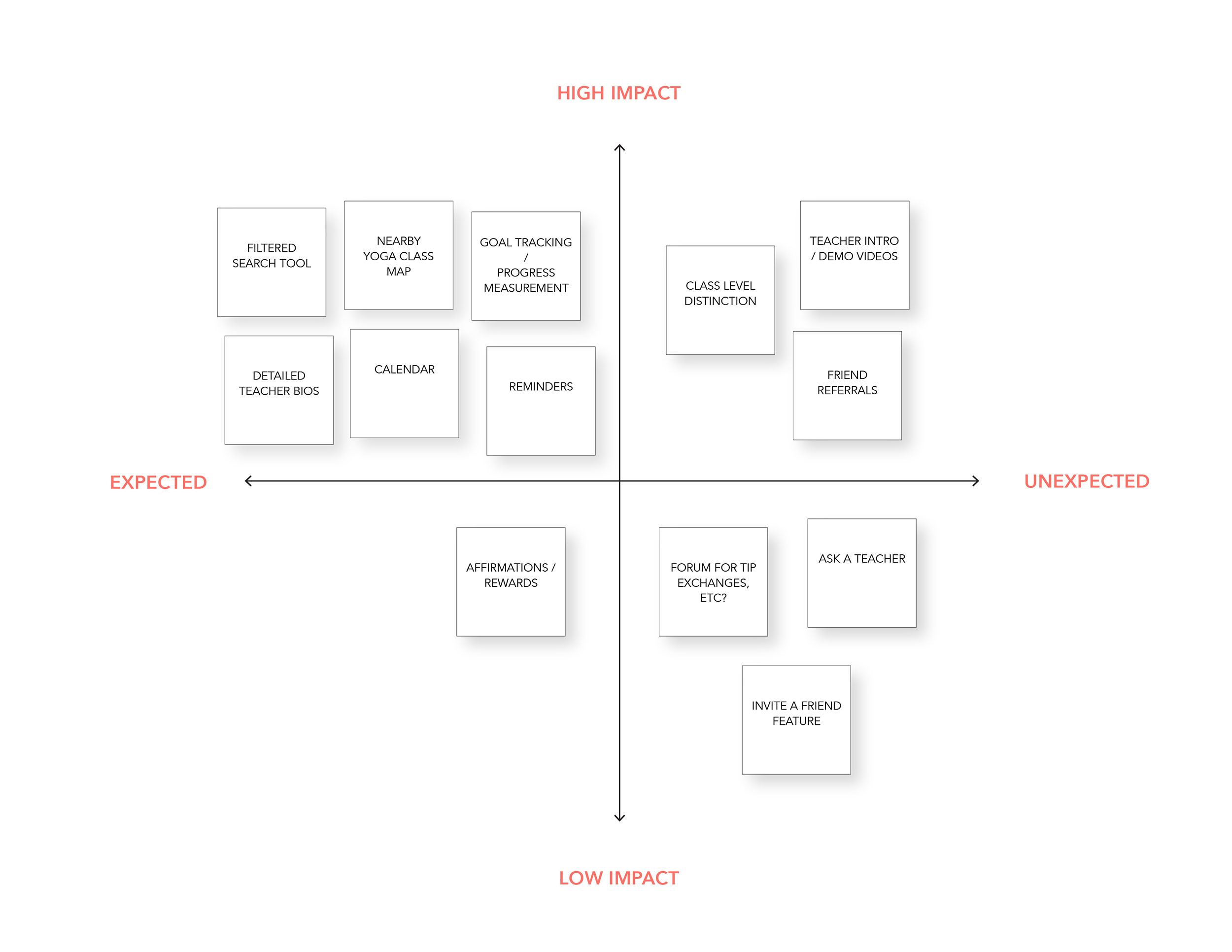
FEATURE PRIORITIZATION & Information ARCHITECTURE:
With a revised goal in mind, it was time to begin building the structure for my designs. I started by listing out features that matched to user goals and then placed those features within a 2x2 matrix to visualize what truly adds value to our experience while planning accordingly for available resources and effectively building upon existing user behaviors.
What is already expected from most advanced yogis when searching for the perfect class?
What unexpected features can we provide that the majority of users will value most?
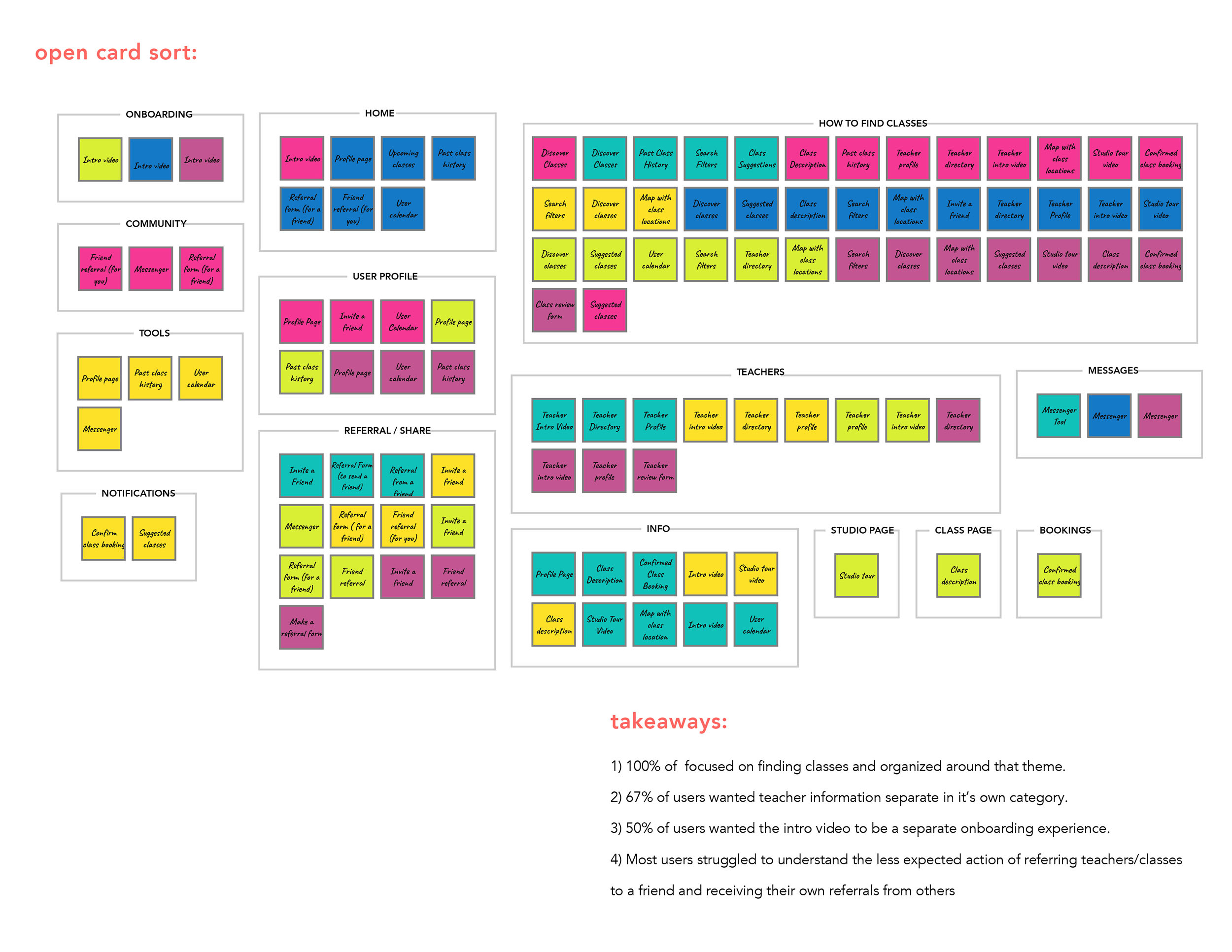
In addition to the framework provided from my thought processes, I conducted several open card sorts with potential users. Open card sorting is a generative tool most helpful in looking for patterns to how users classify and categorize various feature sets. It also reveals what terminology they use when making these distinctions.
CARD SORT TAKEAWAYS:
Users organized themes around finding classes as a priority.
67% of users wanted teacher information in a separate category of its own.
Most users struggled to understand where to place the feature of referring teachers or classes to a friend, as well as the feature of receiving their own referrals from others.
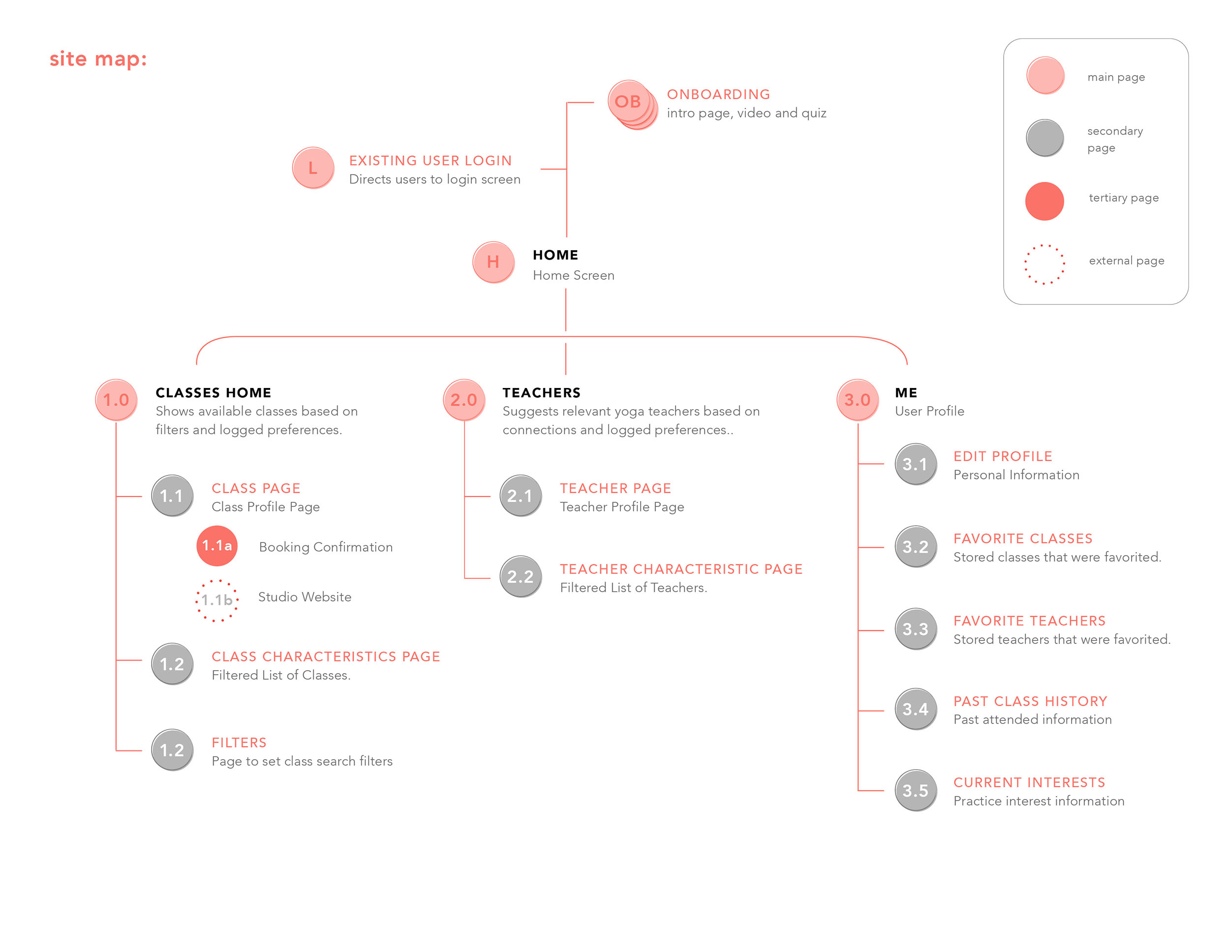
Site Map:
The findings from my card sort, along with my personas, user flows and feature matrix were used to inform the structure of our Site Map where class details and teacher details are separated and a third section exists for user customization.

““(Trying a new teacher) depends on the scheduling... if it’s accessible by schedule or location””
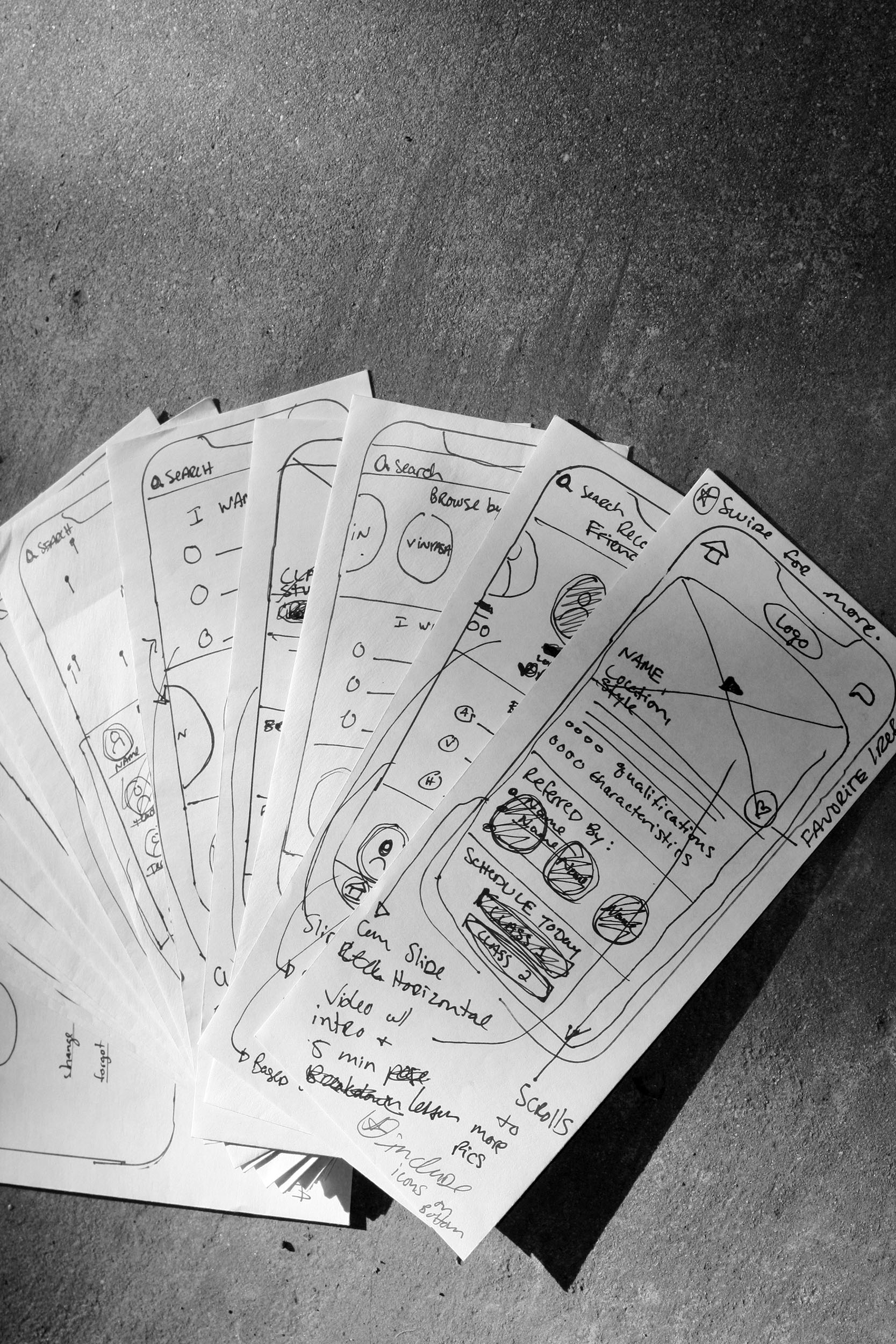
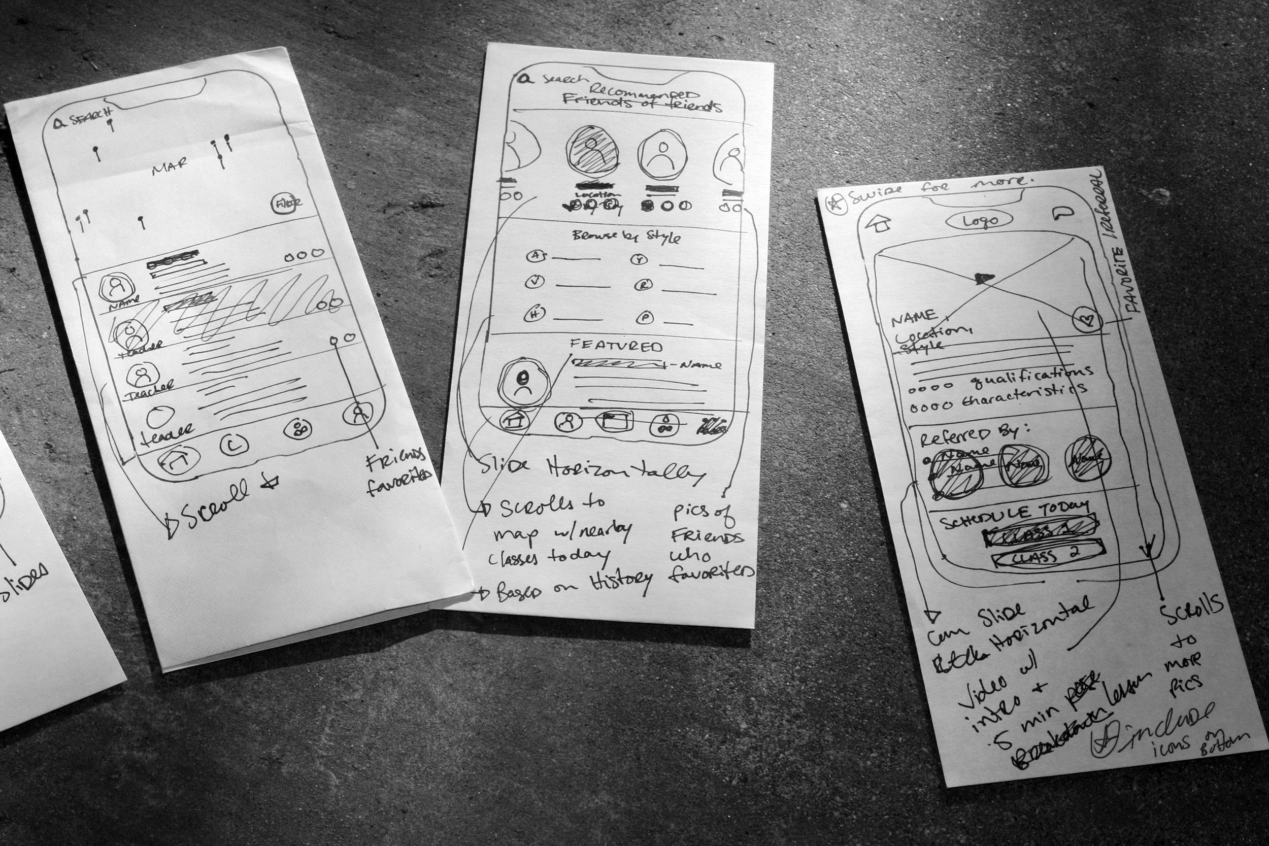
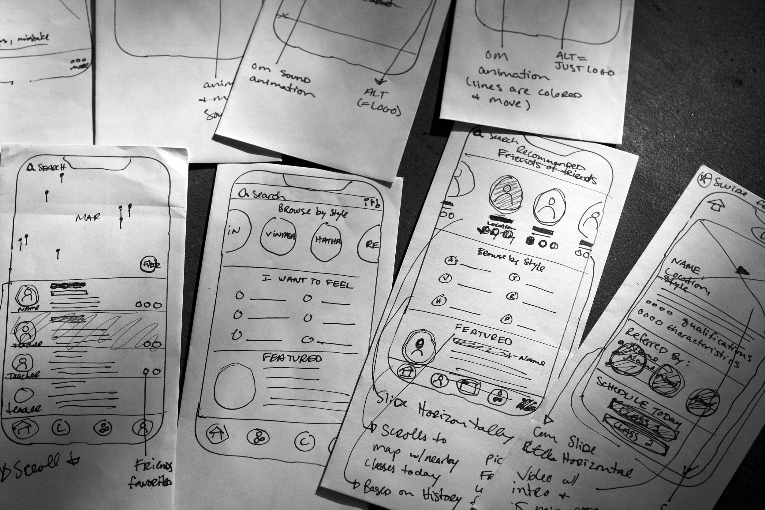
PAPER PROTOTYPE & WIREFRAMING
Now that the structure of our designs was mapped out, I proceeded to begin wireframing. Here, my goal was to sketch out the blue prints for my final design, while creating clear design patterns that remained consistent across our platform. I did this by considering screen content (item location, size, and placement), relative font sizes, overall layout, and the development of interface elements all in relation and consistency to existing iOS system level patterns.
I started by building a quick low fidelity Paper Prototype that had minimal indication of all general elements and no copy. I tested this first round using InVision to see if our initial structure communicated effectively before proceeding towards more in depth designs. This type of testing provides immediate user feedback without wasting large amounts of time and resources.
DIGITAL WIREFRAMES & USABILITY TESTING
After the Paper Prototype, I took the feedback from those tests, and sketched out our medium fidelity wireframes. In this round I included body copy and annotations for our development team. To cover the most aspects of our MVP (minimum viable product), I chose to focus on our Persona B user flow. This flow showcased all of the elements that set us apart from our competition and made our product a unique offering. Completed wireframes were tested and adjusted through multiple rounds of iteration in a clickable prototype using the InVision app. Data from these tests led us to the following important considerations:
MAJOR TAKEAWAYS:
Users prioritize search for classes over search for teachers.
Users respond well to the friendly look & feel of this design.
Users like the idea of connecting with friends, but are wary of trusting a new app before they have tested it themselves for a time.
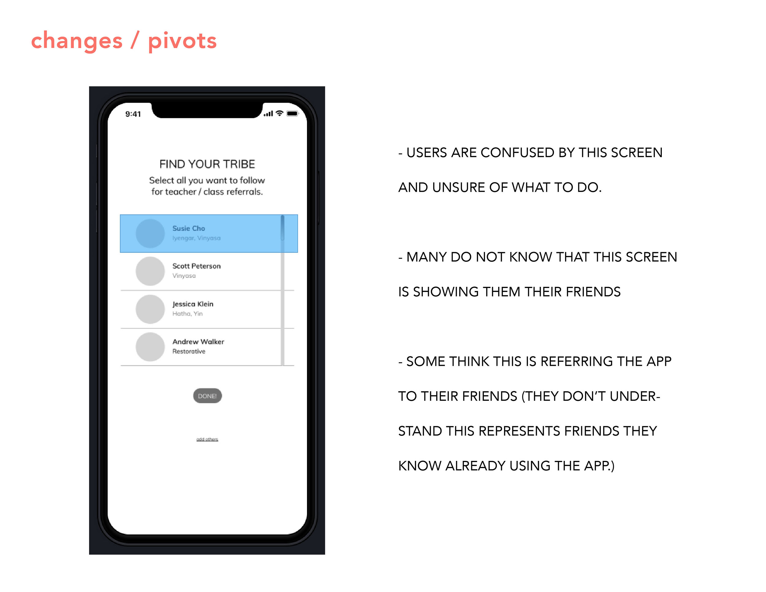
Users are confused about the action of sending recommendations to friends, and / or receiving recommendations for themselves.
Users like the unique in depth yoga information and filtering options, but still prioritize logistics in their basic needs.
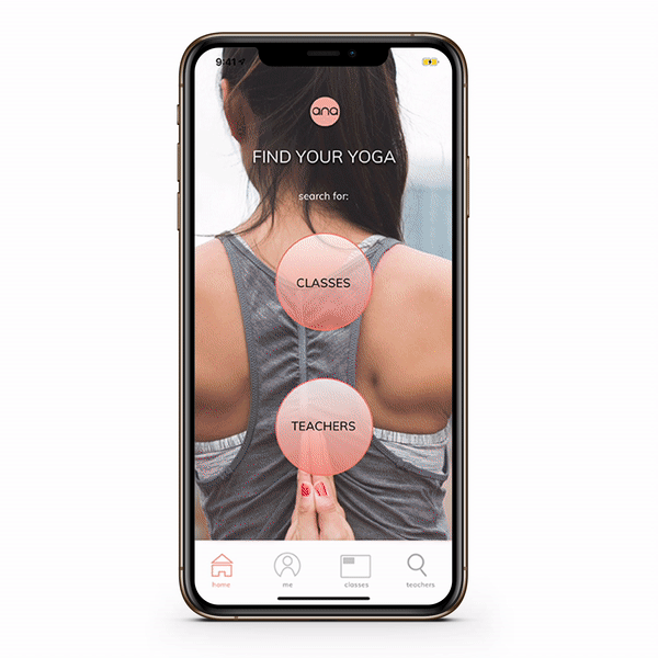
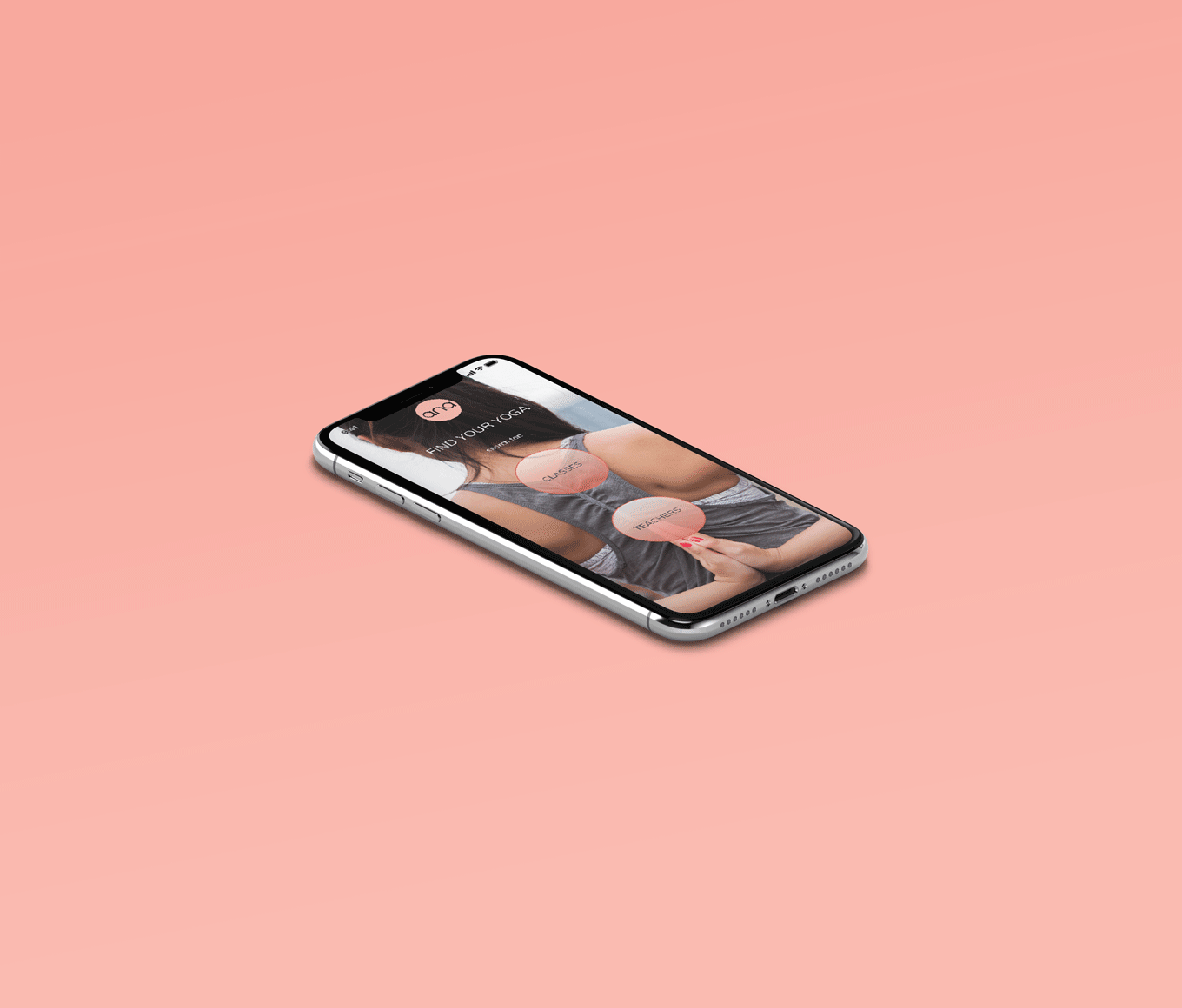
Following this important feedback, I decided to save our sharing with friends feature for the Next Steps of this application, and instead launch our MVP without needing to connect with others immediately. I also adjusted the initial layout so that ‘Classes’ is the top button over ‘Teachers’, and prioritized execution of a Persona A flow that would clearly provide easier access to crucial basic information before allowing for in depth details.


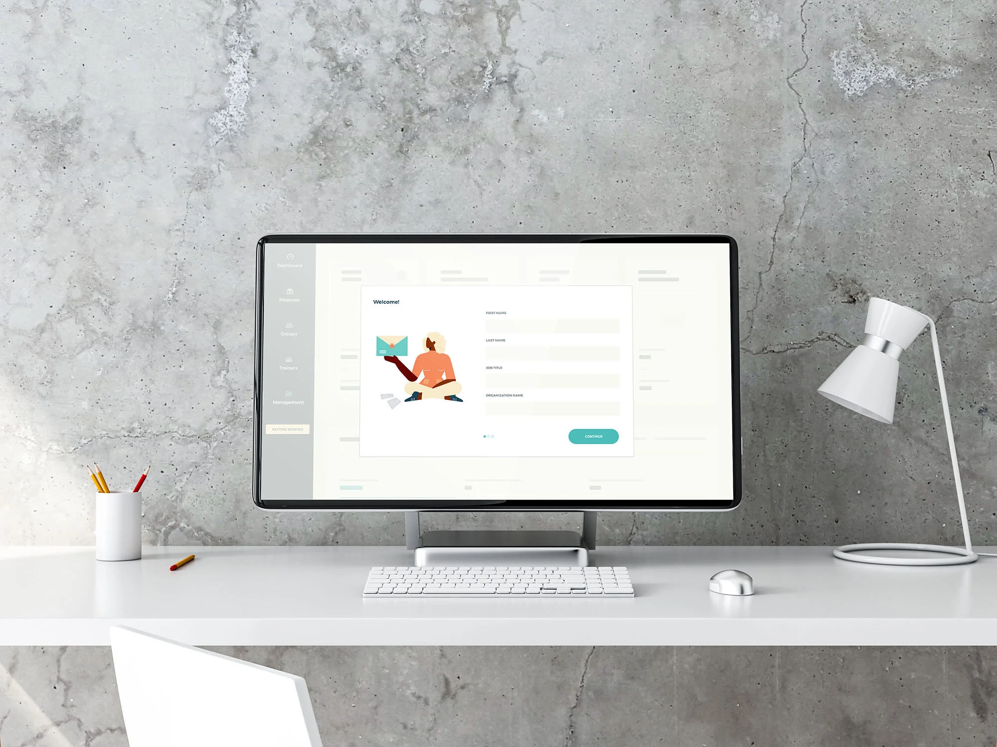
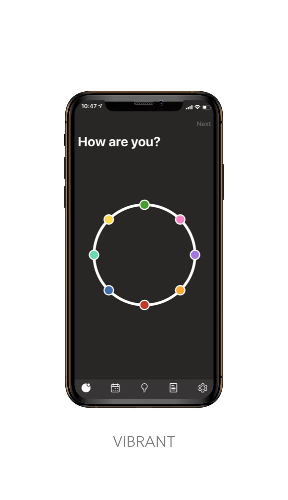
ON BOARDING
Since ANA would be a new app, I knew I needed to craft an on boarding experience that would be at once, memorable, engaging, and informative. The on boarding needed to gather the necessary details for running the app, while communicating strong value to our new user base. My goal was to create stickiness, or lasting value that yogis would return to repeatedly to meet their needs.
Considering the Hooked method, I decided to create a fun introductory quiz with playful language that would have yogis establishing their preferences and goals (reminding them of why they practice yoga), while affirming their efforts with rewards of the hunt (finding an intriguing new class) and rewards of the tribe (favoriting best teacher matches).
VISUAL DESIGN
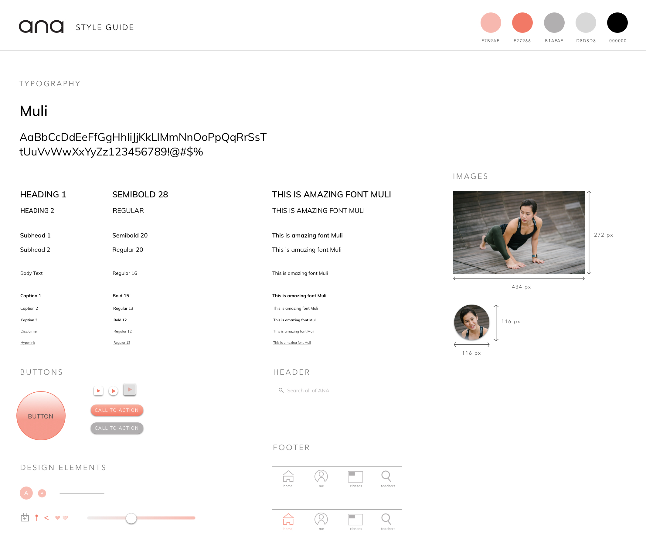
In quiet but substantial support of this experience, I chose a clean visual design approach. Back in initial user interviews, multiple yogis had expressed to us the importance of welcome in their yoga rituals. They preferred studios with desk staff that were friendly and approachable as well as environments with lots of light, cleanliness, and order. I kept these characteristics strongly in mind when developing a style guide that would capitalize on white space, an upcoming trend towards minimalism, and one clear and approachable typeface to establish easy clarity.
Rounded UI elements and the Muli font were chosen to provide a soft look & feel, while a warm palette featuring the 2019 Pantone of the Year, Living Coral 16-1546, was made more approachable by a foundation of warm muted grays and a clean black and white canvas.
“I like the friendly language and tone, other apps are often very cold in comparison.”
FINAL PROTOTYPE
For my final designs in this development cycle, I updated my wireframes to include the visual design parameters dictated by our Style Guide and added our newly edited On Boarding experience (I shortened the original quiz by a few questions and clarified descriptions based on testing feedback). As you can see, the final prototype runs smoothly from a friendly introduction all the way to clean and effective searches for classes.
Next Steps
The following was not advisable to launch in the MVP, but would be worth considering in our next design cycle:
Additional Testing and Iteration of the Visual Design / On Boarding.
Developing the Me (User Profile) section.
Adding a Friend Referral Feature.