
INSIGHTS (Onboarding - No C&C screens)
Creating an Onboarding Experience
̌
PROJECT OVERVIEW
Insights is a new analytics platform that simplifies the process of monitoring and assessing savings groups’ data for NGOs (non governmental organizations) in the microfinance space world wide.
With DreamStart Labs’ launch of this new tool, they needed a way to introduce Insights to clients while simultaneously setting them up to use it.

Challenge
Design a user friendly onboarding experience introducing brand new technology to an industry that has been working with the same outdated program (SAVIX MIS) for over a decade.
Project Scope:
Project Type: Web App
Platform: Windows
Deliverables: User Research Artifacts, Lo Fidelity Wireframes, High Fidelity Visual Comps, Visual Design Library
Tools: Whiteboard, FIGMA, Coda, Miro
TEAM MEMBERS:
Jennie Vader - Product Manager
Christina Chan - Senior Product Designer
Natalia Cebotari - Motion Graphics Designer
My Role:
UX / UI Designer
discover:
who is dreamstart labs?
DreamStart Labs creates award-winning digital banking technology which makes it easy for previously unbanked individuals to save money, build credit history, access loans, and achieve their financial goals. They are currently the proud developers of DreamSave App, DreamSave Insights, and the soon to be developed DreamSave Simulator.
DreamSave Mobile: An app used by savings group communities to record and share information about their groups and their groups’ activities.
DreamSave Insights: A dashboard for NGOs and Non Profits to monitor data and assess financial portfolios as well as Savings Group health.
DreamSave Simulator: A simulation tool for non-profits (further details have yet to be released).
A Quick Synopsis
DreamStart Labs had just launched DreamSave Insights, a brand new analytics platform, and the first new digital banking technology the micro finance industry would be exposed to in over a decade.
Insights’ key offering was its ability to procure real time accurate snapshots of financial portfolios and savings group health in a user friendly interface.
This innovative technology was primed to have a huge impact on changing lives. The only obstacle that remained was getting various NGOs set up for success with a brand new interface. I worked with DreamStart Labs to imagine:
how might we.... onboard large organizations to a brand new piece of technology in the most effortless way possible?
As the UX designer on this project, I made the following key achievements:
Championed User Wants / Needs / Frustrations
Established a Research Lead Human Centric Design Process
Challenged Stakeholder Assumptions to ensure user centric solutions
Narrowed and Refocused the project scope

Let’s Dive In
From distilling research and looking at the scope of the project I knew that the greatest opportunity to ensure client satisfaction was to establish a welcoming atmosphere with easy learn as you go guidance.
The trick was in creating a solution that would do this unobtrusively while still acquiring the information Insights requires to operate.
I started with a quick C&C analysis to see how existing CRMs were onboarding new clients. This helped me identify what users would expect and be familiar with, as well as what opportunities Insights had to set itself apart.
Takeaways:
Friendly, Casual, Engaging language
Setup Check List
Optional Tutorials
Complete Later Option
Learning Tool Tips
Progress Indicators
Minimal amount of Screens before main product
Clear Calls To Action
establish empathy
I helped the product team to reframe and contextualize our challenge with direct user insights by compiling personas and other research deliverables that aligned us as a team and shed better light on the ecosystem we would be designing for. These key insights allowed us to save resources by starting the process with clear understanding of our main user, Global Program Managers.
Artifacts like these also provided us with easily referenced tools to share in communication with Stakeholders.

make:

Focused Design Approach
I helped our product team define key areas of focus by distilling research into the three actionable problems to solve. I did this by overseeing the DreamStart Labs user research process, synthesizing the data results, and generating happy user flows based on our findings.
Actionable Problems:
Help clients set up and invite users
How might we make account set up and inviting users quicker and less daunting for already inundated upper management?
Help clients regulate access to sensitive financial data
How might we help clients from varying NGOs, with varying internal structures, protect their sensitive data while still providing access to the users that need it?
Provide clients with access to many different types of aggregate data
How might we help clients prepare for donor reports potentially requiring an infinite range of data analysis?

problem 1: Help Clients Set Up & Invite Users
To help clients set up their organization’s accounts and onboard potentially large numbers of personnel, I looked at different onboarding methods that could alleviate impatience and / or frustration at what could be a tedious and lengthy process.
Based on what I had seen in the marketplace, I knew that many similar products were accomplishing this task through:
Waterfall Invite Systems
Account owners invite say ten users to Insights. Those users receive e-mails with guided instructions to onboard themselves, then those users invite another ten employees, etc. etc.
Limits the amount of users any given manager must input or invite, distributing that burden more evenly
Teaching Onboarding
An orchestrated guide using tool tips, roadmaps and success states to show users through the process of account set up while simultaneously teaching them about the main functions of Insights.
Lessens impatience to get started by allowing users to learn as they go directly within the main product.
Permits users to complete at will, i.e. do only part of the set up and come back later, skip entirely and figure out on your own, or complete the process with guidance from start to finish.


Upon expert guidance from stakeholders, I learned that clients were already keeping employee contact information in existing spreadsheets. Therefore, I decided to add an import contact list feature where users could drag and drop existing files to upload large batches of users at once. This was especially helpful since some user roles would always have to be entered manually.


Progress indicator state pops up while user list is uploading.

Success state animation announces list has been uploaded and provides CTA to review details.
User testing also showed us that clients wanted a way to track user invites so we created an ‘Invited Users’ tab in the org account settings which tracked invite status and allowed for a quick invite resend should users notice some invitations remain unopened for too long.

Potential errors are highlighted with an option for users to edit and correct before importing.
problem 2: Help clients regulate access to sensitive financial data
Initial Concept:
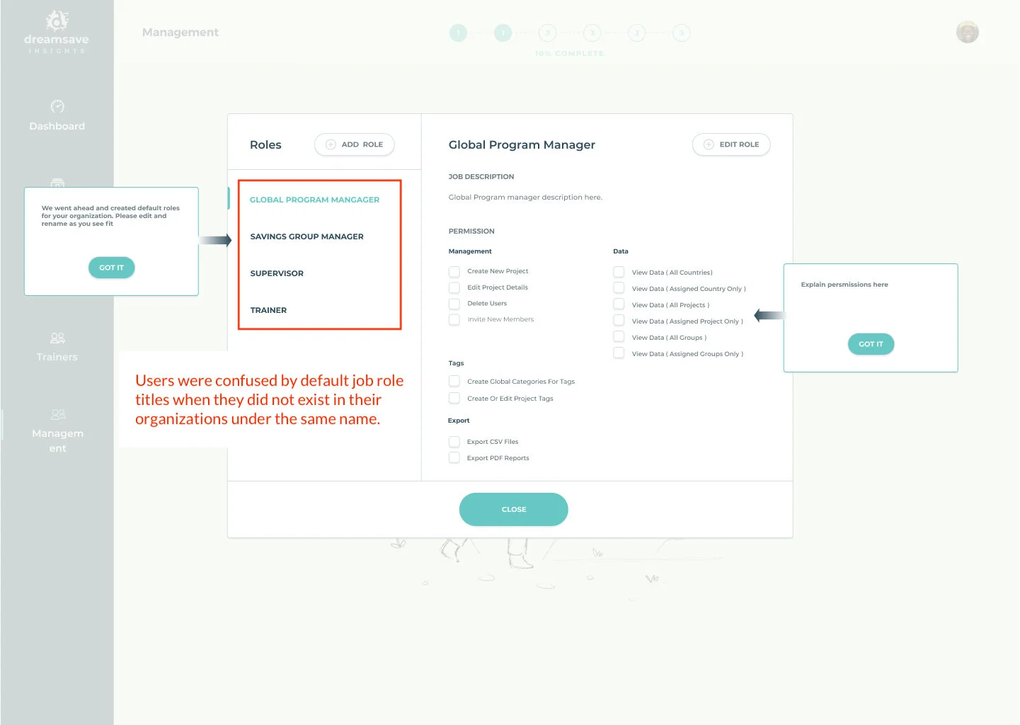
To help clients regulate access to sensitive financial data, I initially created solutions with default job roles and pre populated permissions. We later found out that this was unhelpful because NGOs had varying internal structures and users were often confused if they could not find the job titles their particular organization used.
Final recommendation:
Users were getting confused by unrecognized job titles, so rather than regulate data access by job roles, we decided to do it by permissions levels. To create a familiar system users would trust, I looked back into our NGO research and found that most organizations seemed to sort their information by project, country, and organization wide brackets. I used those same divisions to create our new default permissions for users to choose from.
Since permission levels then regulated data access, job roles were made free to be completely customizable.

Left image is of default permissions levels in settings. Right image is of default permissions offered in user invite modal.


Permission level details. Permissions have been sorted for easy access into categories.
Final Recommendation:
Users were getting confused by unrecognized job titles, so rather than regulate data access by job roles, we decided to do it by permissions levels. To create a familiar system users would trust, I looked back into our NGO research and found that most organizations seemed to sort their information by project, country, and organization wide brackets. I used those same divisions to create our new default permissions for users to choose from.
Since permission levels then regulated data access, job roles were made free to be completely customizable.
Problem 3: Provide clients with access to many different types of aggregate
Initial Concept:
To help provide clients with aggregate data for unlimited potential reports on Savings Groups health, our Stakeholders initially suggested creating a tagging system that could be customized to track infinite data parameters. We agreed to test that concept and later found that development, time, and budget constraints made that concept impractical . The solutions were either not truly customizable to the user, or they required clunky design / development implementation. It was time to pivot and rethink potential solutions.


Final Recommendation
When brainstorming alternate options to tagging, I spoke more with stakeholders to learn the specific use cases requiring aggregate data analysis for Savings Groups. Reviewing those details, I realized that we needed to refocus the task scope. Rather than try to solve for all the potential use cases (which could be infinite and unpredictable), it would be more effective to solve for the majority of use cases.
With that focus in mind, I reviewed the research and realized that most aggregate data needs could be met by completing the following actions:
Ensure that Savings Groups are always assigned to a project and a facilitator (because these are the organizational methods NGOs use to track Savings Groups)
Make sure that Savings Group status is always up to date (because this is the most common measurement NGOs rely on to quickly assess Group health)
To ensure that these actions are always being met, we created a notification system that alerts users when any of these parameters are not completed.

Following the animated tool tip, users click into the Groups Overview page where the list of groups has been filtered down to the ones that require attention. Different filters for missing criteria (unassigned groups, groups without projects, groups with unspecified status.) can then be selected in the dropdown menu “Notifications”. Insights by default will pre-select all missing requirements unless otherwise specified (shown below). If for any reason, users wanted to deselect a filter, they can just ‘X’ out of that particular classification in the filter bubbles below the search bar. To complete missing details, users click the easy CTA buttons on the floating banner at the bottom of the list.

Insights design system:
The main dashboard of Insights was created before our onboarding design, so a robust, thorough design system was already in place. Our added implementations followed the original design system closely and expanded upon it where needed. Examples of added features included:
Modals over main product
Progress Indicators
Animated Tool Tips
Toast Notifications
Error Notifications
Friendly Animations & Illustrations
Getting Started Guide
Set Up Group Data Guide (PDF)
Blank States
All of these additions can be seen in the completed Onboarding Experience below:
Wireframes & User Flows in progress for this project. Please zoom in to review.